
Trends in the Wild: Retro Yellow Typefaces
Ever heard of the Recency Bias or Frequency Illusion? It’s that phenomenon where once you become aware of something, you start noticing it everywhere. Well lately, I’ve been experiencing that with yellow throwback typefaces. It seems like the year of yellow is upon us, and even big names like Google and Progressive are embracing it.
So, why does this trend work?

Wes Anderson is kind of the OG of this trend. If you check out movie posters for The Life Aquatic, Moonrise Kingdom, The Darjeeling Limited, or Fantastic Mr. Fox you’ll see he’s been doing this for years.
The Allure of Nostalgia
Deep down, most of us are suckers for the good ol’ days. Seeing familiar typefaces from the TV shows or movies of our past, creates a comforting sense of familiarity, taking us back to simpler times. In a world obsessed with 4K everything and AI everywhere, there’s something undeniably charming about the vintage aesthetics of the past.

Progressive’s “TV Dad” campaign starred one of our favorite TV Dad’s from the ‘90s, Carl Winslow. They’re really tapping into that TGIF nostalgia.

Poker Face used this trend to pay homage to it ‘70s crime-solving inspirations, like Columbo and Murder, She Wrote.
The Power of Yellow
Sure, the color yellow is far from being a trend (I mean it’s a primary color after all), but it’s definitely having a moment. Yellow is synonymous with positivity, energy, and warmth. Plus, it's one of the most legible colors, making it an easy attention-grabber for brands. Pair that vibrant yellow with a bold typeface, and you’ve got a winning combination that is not only eye-catching, but captures the essence of the past.
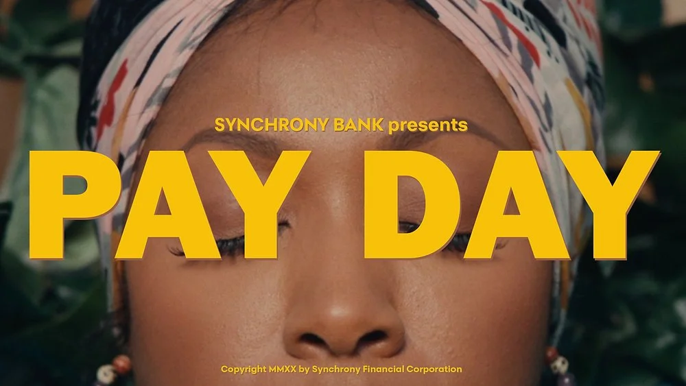
Look how much this Synchrony Bank thumbnail stands out. Bold and yellow typefaces will never fail at grabbing viewers attention.
Pushing Brand Boundaries
While we are all about adhering to brand guidelines, sometimes it's okay to step outside the norm, especially for a specific campaign. Experimenting with typefaces and production styles helps your brand stand out from the crowd, captivate your audience, and create a memorable brand “experience”.
This Google Pixel ad is a perfect example of using a font that’s outside your brand, but works because it’s tied to a specific campaign.
As a creative agency, we're always on the lookout for new inspiration and finding ways to embrace these emerging trends. Recently, we had the opportunity to partner with Higher Logic Vanilla to create an overview video, and we thought this would be a perfect fit to try this yellow throwback trend. In a world saturated with ubiquitous product videos, we were determined to create a final product that rises above the rest. So we set out to blend the old with the new and have fun with unexpected visuals. That's how to stop the scroll while staying true to the brand. You can check out the final result below. 👇
So get ready because you’re going to start noticing this trend everywhere. Just you wait.